
Call Us Today!
Call Us Today!
You probably already know that paint colors can be very expressive of who you are, but did you know that colors can be used to evoke a certain feeling? This is especially true when using these colors to paint the interior of your home.
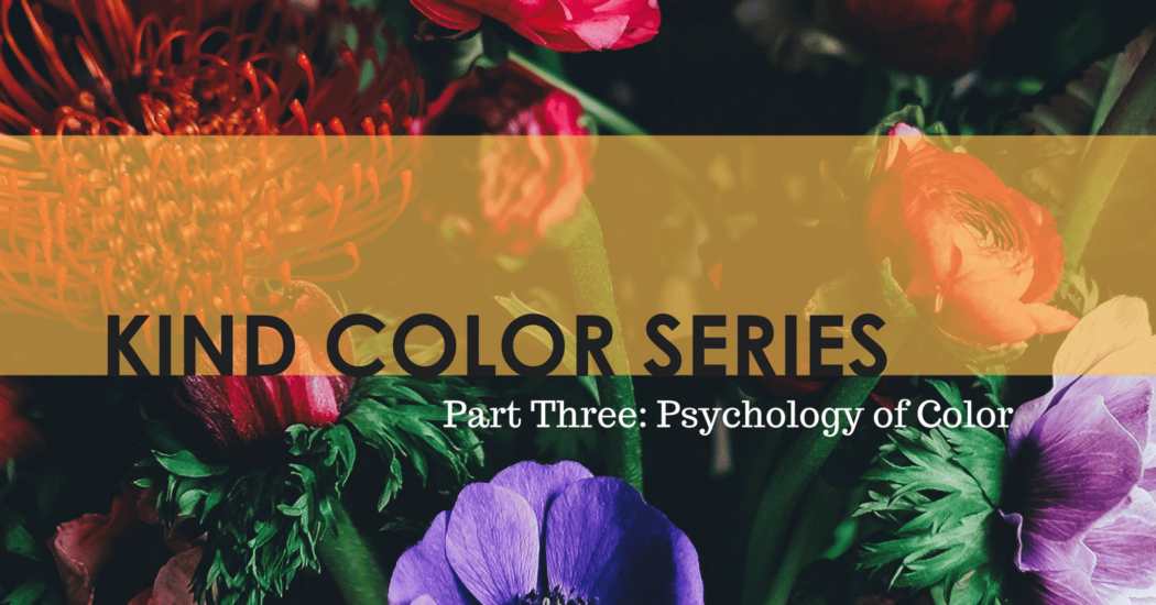
From relaxed and serene to bold and thought provoking. Color can help transform a space and entice the specific vibe you are going for. Today’s post will help give you a breakdown of the psychology behind each color and where it can be most powerful in your home.
Before we get into it, though, make sure you’re ready for Parts One and Two of our Kind Color Series. Alright, let’s do this!
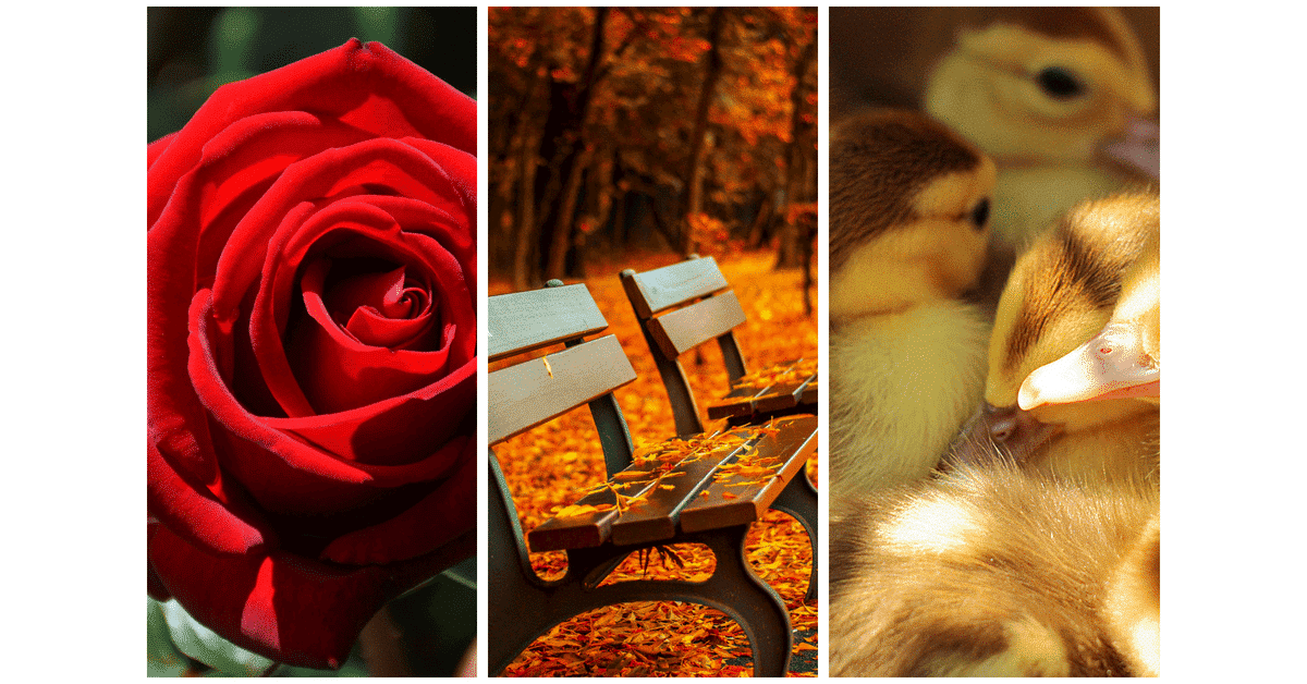
Ah, red. The color of passion and heat. What better color to begin with? Red is an incredibly bold color that will make a statement.
You often see red being used for front doors and accent walls, but what message is that sending to neighbors and guests? This attention grabber gives off a feeling of strength, warmth, energy, and excitement.
We find that orange is one of those colors that you either absolutely love or hate. There are very few people who land in the middle. Notoriously known as a ‘fun’ color, you’ll want to be strategic about where you use this vibrant shade.
In our very humble opinion, yellow is by far the happiest color. Think about it: the sun, sunflowers, bumble bees, and lemon drops. Yellow makes us reminisce about warm summer days, and it doesn’t get much better than that.
You should note that this color is very stimulating to the eye, but it can easily be overpowering if it is too much or if it’s too bright.
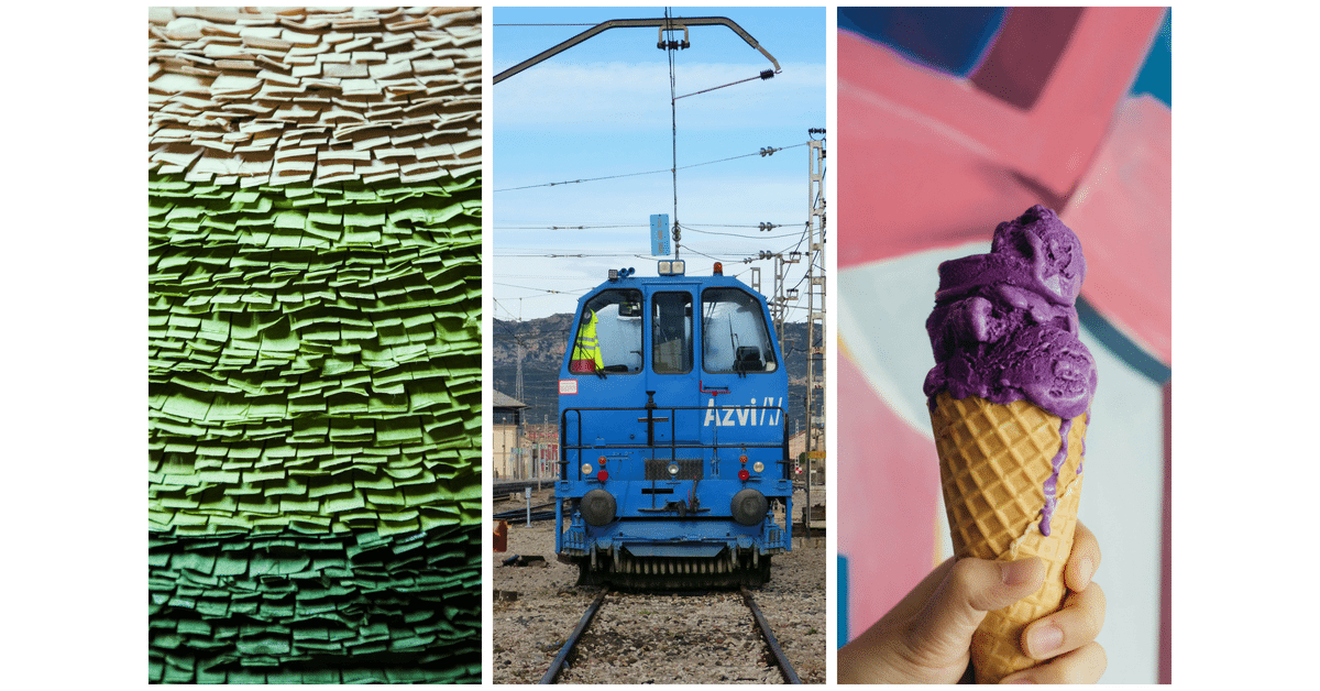
The second most popular “favorite” color in the world, green embodies nature and balance. Fun fact; green is the only color that hits the eye in such a way that it does not require adjustment making it one of the most restful colors.
On a primitive level, we are reassured by green, as it is a sign of water and life. This means if you’re looking to bring an organic breath to a space, green may be right up your alley.
Blue takes the number one spot for the most popular favorite color, but why do you think that is? Blue causes a more emotional and mental reaction, unlike colors such as passionate red, which are more physical. Blue is known as an intellectual color and emits a feeling of trust and serenity.
Violet, or purple, definitely makes a statement, but not quite in the same way as colors like orange, red, or yellow. Originally a symbol of royalty, this color gives off a feeling of luxury, quality, and depth. This color is wonderful for rooms where you wish to inspire deep thought, for example, a spa-like bathroom.
Oddly enough, or maybe not so oddly, grey is the only color that is psychologically neutral. This means it doesn’t evoke a certain emotion; however, be wary of overusing grey. Too much grey can evoke a lack of energy.
Rarely used as a core color for decorating, black is phenomenal for use in small doses. Black is elegant, sleek, and sophisticated. That being said, many people are afraid of the dark, so definitely be careful with this one. We find it works best on the exterior of the home.
White is all about creating a clean, fresh, and sterile look. Too much of it, and you’ll be giving off “don’t touch me” vibes. With just the right balance, though, you can create a classic or modern look. Honestly, it will be hard to go wrong with white.
Honestly, we find brown to be completely underrated. Yes, it can be a serious or dull color, but it also symbolizes earthiness and nature and helps to ground a space.
Also, what color does everyone paint their walls when they’re trying to sell their home? That’s right, beige. Don’t be afraid to explore the different ranges of brown to see if they might add support to your space.
Phew, we made it! Hopefully, now you understand more about the psychology of color and how choosing a paint color can play into the feeling of a room when you paint your house rooms with it.
Who knew there was so much to understand about choosing paint colors? Join Kind Home Solutions next time when we explore a little-known tip for picking paint that’s sure to surprise you! Contact us today to learn more.